
Companies · Brand Identity
B Line Events
A brand elevated to stand with its competitors, and say its own name.
- Brand Identity
- Brand Messaging
- Website Design
- Sales Collateral
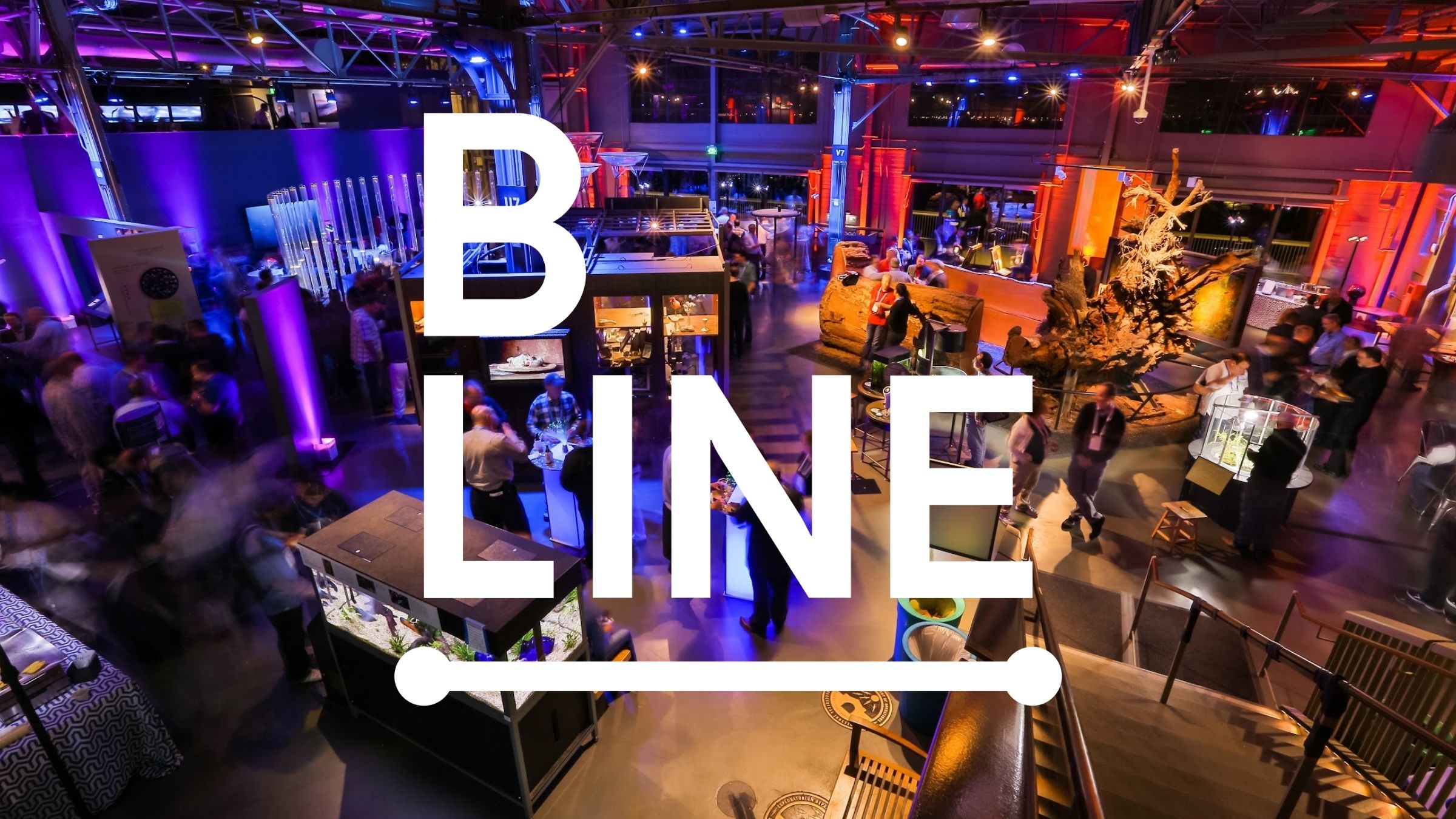
The short version. B Line Events had outgrown its look. Roar elevated the visual identity to shift how the brand was seen next to its competitors, without losing the small-but-mighty personality that made it work.
Where they started. B Line’s identity did not carry its weight. It read like a placeholder, and it did not even clearly say the company’s name (B Line, not “Bline”). The brand no longer matched the caliber of the work, or the competitors it stood beside.
The move. We explored three distinct identity directions, each with stylescapes to picture how it would live across real applications, color, and imagery, before committing to one. When the team wanted to see color alternatives, we proposed new palettes with the competitive set in mind, and they landed on our first application. The final system shipped with a full brand standards guide.
What we made:
- A reimagined brand identity that clearly says its name, with a full brand standards guide
- Deep color application research and a competitor analysis
- Revamped brand messaging and a redesigned services architecture
- Capabilities and pitch decks, plus reimagined sales collateral
- A full website redesign with a new messaging strategy
What happened. B Line Events came away with an identity that finally matches its ambition, a brand that stands up against its competitors and, at last, says its own name. See the brand in action at blineevents.com.